Methylation Normalization ← Return to Omics
Project description
This stage is focused on preparation, organization and normalization of DNA methylation, clinical and technical data from ROSMAP (Religious Orders Study (ROS) and the Rush Memory and Aging Project (MAP)).
Data preparation steps
Clinical and technical variables
Clinical information was collected from three different files shared by
Dr Jingyun Yang, sent by Dr Chris Gaiteri on May 23, 2015 and on June 4th, 2015) and
can be requested through the RADC Research Resource Sharing Hub.
The files were merged by projid - an eight-digit subject id
(leading zeros were added where necessary). Technical information about
the arrays (Illumina Sentrix ID, Illumina Sentrix Position, sample
amplification plate, well and row) was obtained
from the file tech_var_748qc_batch.txt
(shared by Dr Jingyun Yang). Technical and clinical data were then
merged based on the Sample_ID. The final data set (referred
to as metadata in further discussions) contained information for
748 subjects.
We then read the data from all chromosomes (1 to 22) into an R
session. We reordered the chromosomes according to the
order_id column in the metadata and assigned column
names using the projid column in the metadata. We
exluded 8 subjects based on the delt column of the
metadata. We assigned CpG IDs as row names to each chromosome.
We used the list of
filtered probes
to select only the reliable probes in our data. The list of the
reliable probes for this platform was provided by Dr Jingyun Yang.
Number of CpGs for each chromosome before and after filtering can
be found in this
file.
Finally, to simplify data storage and distribution we created an object of GenomicRatioSet-class and created an R package with these data. The package contains annotation for the CpGs, the metadata and the explanation of the variables in the metadata. The vignette which comes with a package explains the basic functions for manipulation of this object. The package and DNA methylation data can be requested through the RADC Research Resource Sharing Hub.
Next, we performed normalization of CpGs by their type using bmiq
function in the wateRmelon package. The function was applied
to every column (by subject) of the data. As the result, the Type II
probes were "dilated" to match the distribution of the Type I probes.
We compared "raw" and BMIQ normalized data and concluded that probe
normalization provides some increase in data signal (report comparing raw and BMIQ
normalized probes can be provided on request).
We created an R package to store and load probe normalized data. Identification of
outlying subjects and variable adjustment described in this document
are based on the probe normalized data.
The R code used to produce analyses for this entire document can be
downloaded using this link.
Single variable description
Descriptive statistics is provided for each variable in the metadata. The summary can be downloaded as an Excel file using this link. Here is how the summary statistics were calculated:
- For categorical variables we provide the number of categories. We aslo calculate the minimum, mean, median and the maximum values for the distribution of the cases among the categories and the number of the missing cases.
- For numeric variables we provide minimum, mean, median, maximum values and the number of missing cases. In the column with the number of categories numeric variables have blank.
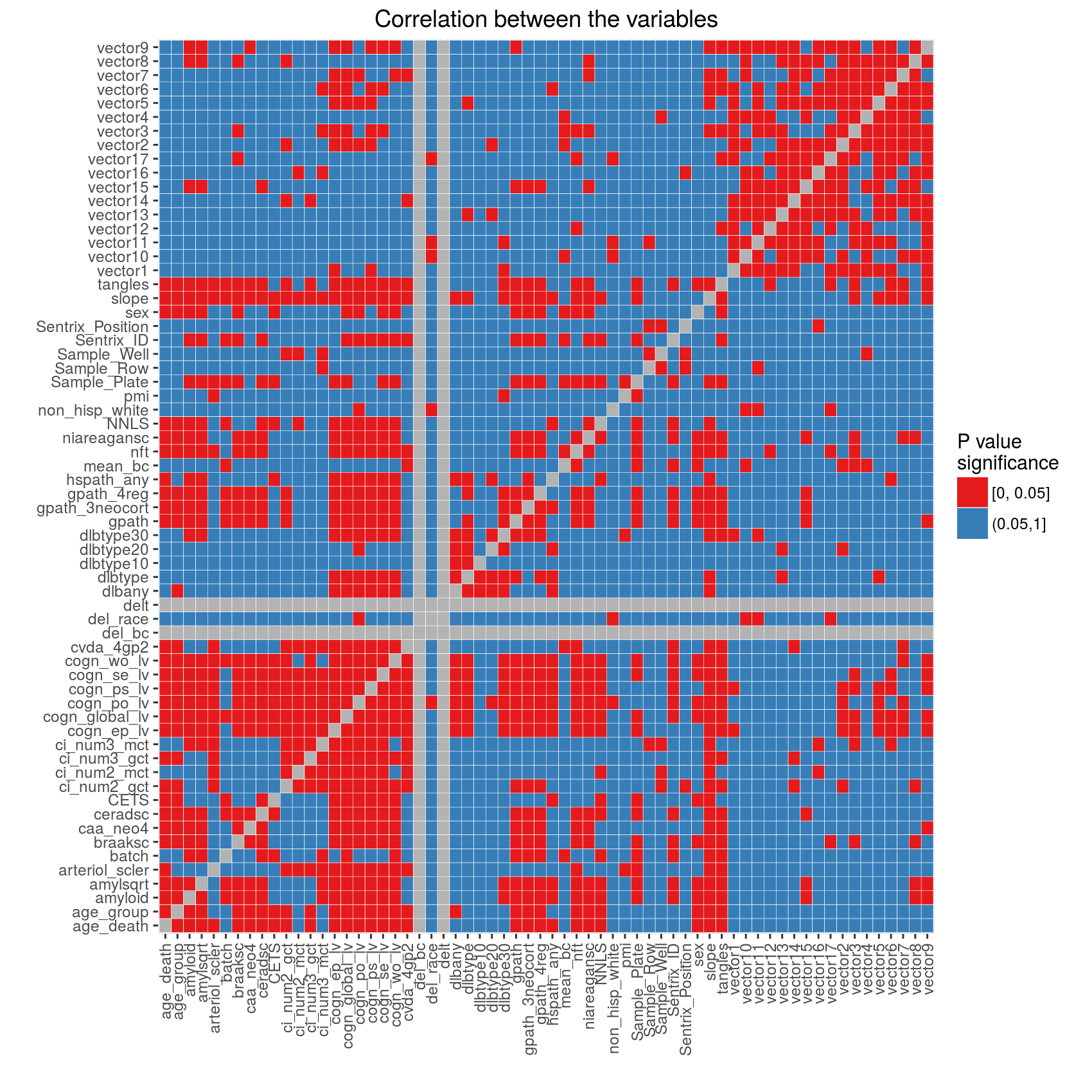
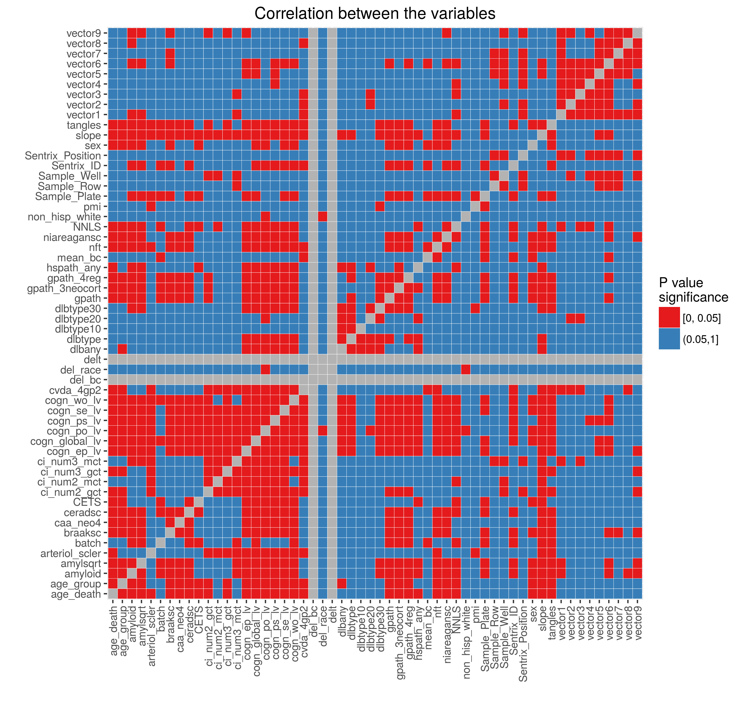
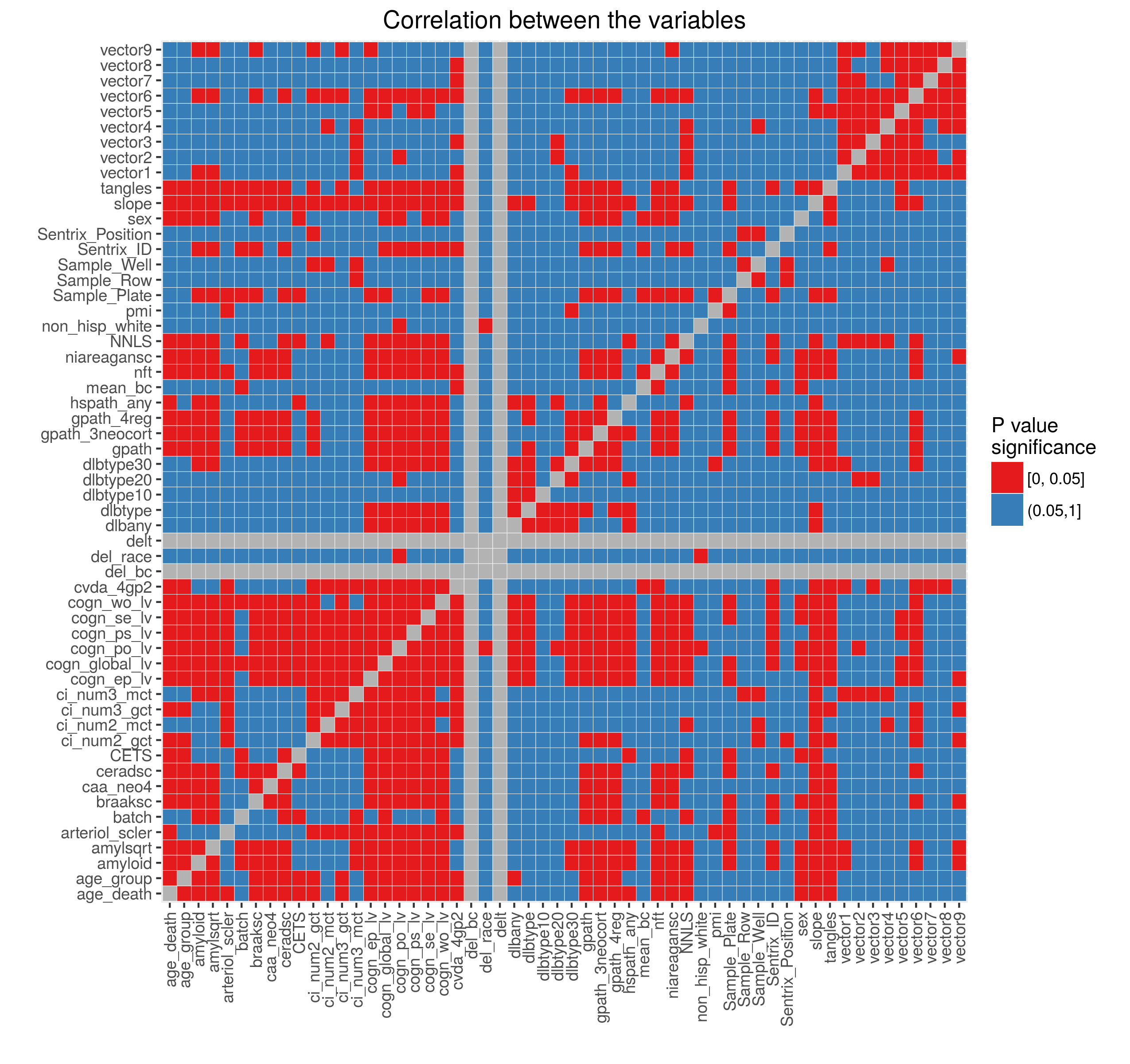
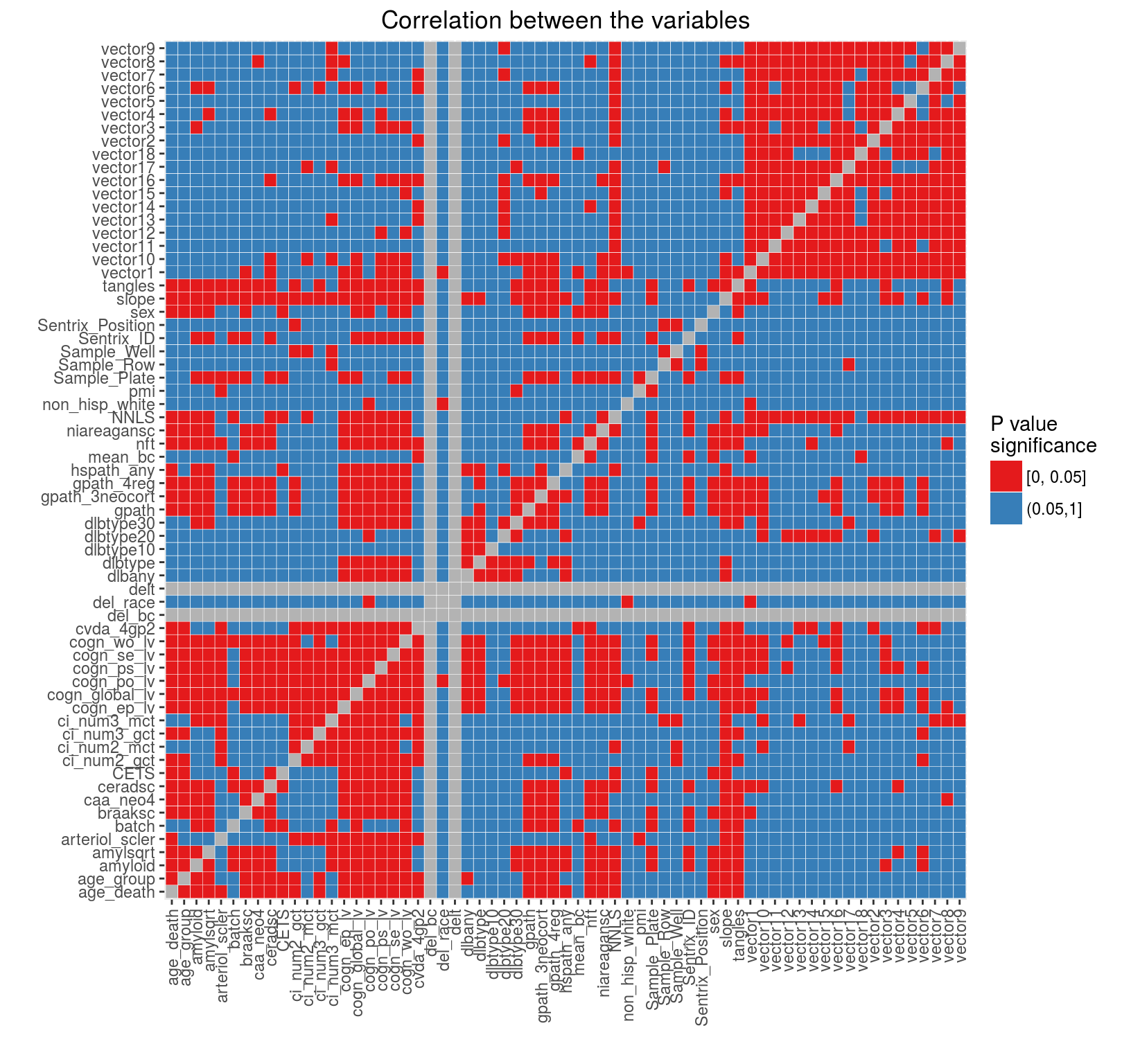
Relationship between the variables in the metadata
To understand the relationship between the variables (describing the subjects and the experiments) we performed pairwise tests:
- between numeric variables - Pearson correlation
- between categorical variables - Chi-square test using Monte Carlo simulation with with 2000 replications
- between numeric and categorical variables - Kruskal-Wallis rank sum test
For each test we recorded the P value, the test statistic and the type
of the test. If a test produced an error or a warning, we recorded the
message and the type of the test. No tests were performed if two variables
were the same (tested against itself). Prior to calculations we
removed all sample identification variables (such as projid,
order_id and Sample_ID, Sample)
as we discovered that they significantly slow down
the calculations (especially for the Monte Carlo simulations). If the
variables were of any other type combination rather than numeric-numeric,
numeric-categorical, categorical-numeric or categorical-categorical no test
was performed. We didn't perform any multiple testing adjustment. Results
can be downloaded as an Excel file using this
link.
For visualization purposes we divided the P values into significant (less or equal than 0.05) and non-significant (larger than 0.05) and plotted the results as a heat map below. Gray squares indicate tests against itself (main diagonal) and tests which produced errors or warnings. Refer to the Excel file for the explanation of errors and warnings.

Relationship between the batch and variables describing arrays
Illumina slides (Sentrix_ID) generally contain 6, 8 or
12 arrays (Sentrix_Position). Prior to hybridization
DNA samples are PCR amplified. It is common for amplification or
hybridization to occur in batches because of the number of samples.
In this section we investigate the relationship between slides, arrays,
batches and amplification plates/rows/wells.
Figure 1: Slides were hybridized in two batches
Each slide (Sentrix ID) contains 12 arrays (Sentrix Position), some arrays are missing. There are total of 65 slides used for this project. Arrays on each slide are grouped by batch.

Figures 2 and 3: Samples were amplified in two batches
Figure on the left shows the relationship between the amplification sample plate (Sample_Plate, x axis) and the Sentrix ID. This shows that the plates were amplified in two batches and the samples from the plates were distributed across multiple slides. The samples from the same amplification batch were not randomly distributed across the slides (all arrays on the same slide come from the same batch).
The figure on the right shows that the problem of array hybridization from the same row of an amplification plate was avoided. Each slide received samples from different rows on the plates.


Explore the effect of the variables on DNA methylation data
We used Singular Value Decomposition (SVD) to understand the effect of the variables on the intensity normalized data (using snm package). Figure on the left below shows the relative importance of every eigen vector. Figure on the right shows the relationship between two arrays which correspond to the most extreme values of the first eigen vector.


Next we take the first 5 largest eigen vectors and calculate their
relationship with the clinical and the technical variables (with the exception
of projid, order_id and Sample_ID).
For each eigen vector we fitted a linear model with a clinical or a technical
variable as a dependent variable. Here we report the overall P values
for ANOVA F-tests for each model. Table below provides the
P values while the figure highlights the most significant relationships.
No multiple testing adjustment was performed.
| PC1 | PC2 | PC3 | PC4 | PC5 | vars |
|---|---|---|---|---|---|
| 1.41E-02 | 7.80E-02 | 3.15E-02 | 7.41E-04 | 6.53E-01 | age_death |
| 9.55E-02 | 6.02E-161 | 1.49E-16 | 5.80E-03 | 4.20E-01 | batch |
| 4.38E-01 | 7.81E-01 | 5.19E-02 | 1.60E-03 | 5.20E-01 | age_group |
| 4.54E-03 | 4.11E-01 | 7.35E-01 | 4.26E-01 | 3.66E-02 | sex |
| 1.78E-01 | 3.67E-01 | 7.30E-01 | 1.68E-01 | 6.18E-01 | non_hisp_white |
| 1.78E-01 | 3.67E-01 | 7.30E-01 | 1.68E-01 | 6.18E-01 | del_race |
| del_bc | |||||
| 4.30E-01 | 1.56E-12 | 7.74E-04 | 6.07E-01 | 8.82E-01 | mean_bc |
| 4.87E-155 | 2.04E-22 | 1.01E-34 | 2.44E-01 | 7.25E-03 | NNLS |
| 6.25E-275 | 1.97E-16 | 8.31E-10 | 7.55E-01 | 1.16E-01 | CETS |
| delt | |||||
| 7.20E-02 | 1.31E-01 | 1.61E-01 | 2.88E-02 | 4.80E-01 | hspath_any |
| 4.14E-01 | 1.65E-03 | 1.58E-01 | 6.51E-03 | 2.54E-01 | niareagansc |
| 6.39E-01 | 8.60E-01 | 4.57E-01 | 7.14E-01 | 9.11E-02 | dlbtype |
| 3.54E-01 | 6.94E-01 | 4.60E-01 | 7.31E-01 | 2.88E-02 | dlbtype10 |
| 7.22E-01 | 4.07E-01 | 3.27E-04 | 9.95E-01 | 5.83E-01 | dlbtype20 |
| 8.87E-01 | 8.16E-01 | 8.93E-02 | 3.82E-01 | 4.24E-01 | dlbtype30 |
| 3.16E-01 | 8.60E-04 | 2.77E-02 | 3.00E-08 | 1.52E-01 | amyloid |
| 8.76E-01 | 5.08E-04 | 7.90E-01 | 6.47E-02 | 1.04E-01 | tangles |
| 4.68E-01 | 1.01E-01 | 9.29E-01 | 1.04E-01 | 7.67E-01 | ci_num2_gct |
| 7.78E-01 | 8.16E-02 | 2.69E-01 | 9.75E-01 | 5.05E-01 | ci_num2_mct |
| 7.63E-01 | 5.01E-04 | 7.73E-01 | 4.91E-03 | 8.10E-01 | nft |
| 6.01E-01 | 1.88E-04 | 2.41E-01 | 2.74E-02 | 2.67E-01 | gpath |
| 4.11E-01 | 4.04E-04 | 3.45E-02 | 2.86E-06 | 9.77E-02 | amylsqrt |
| 6.17E-01 | 6.20E-01 | 2.28E-01 | 4.13E-01 | 5.19E-01 | dlbany |
| 8.10E-01 | 2.25E-01 | 6.23E-01 | 4.06E-03 | 2.99E-01 | arteriol_scler |
| 1.73E-01 | 6.72E-01 | 2.35E-02 | 7.91E-02 | 7.19E-01 | cvda_4gp2 |
| 2.94E-01 | 2.90E-01 | 5.50E-01 | 7.23E-01 | 7.40E-02 | caa_neo4 |
| 3.29E-01 | 2.60E-01 | 1.62E-01 | 2.53E-01 | 8.92E-01 | ci_num3_gct |
| 1.44E-01 | 2.43E-02 | 4.66E-01 | 9.71E-01 | 2.95E-01 | ci_num3_mct |
| 2.97E-01 | 2.08E-05 | 1.26E-01 | 3.86E-03 | 5.98E-01 | gpath_3neocort |
| 5.24E-01 | 3.43E-05 | 2.39E-01 | 1.81E-02 | 3.96E-01 | gpath_4reg |
| 8.78E-01 | 2.77E-02 | 2.44E-02 | 3.88E-01 | 2.16E-01 | pmi |
| 3.11E-02 | 3.84E-05 | 1.71E-02 | 3.60E-04 | 1.57E-01 | cogn_global_lv |
| 7.75E-02 | 2.99E-04 | 1.05E-01 | 1.31E-03 | 6.06E-02 | cogn_ep_lv |
| 7.15E-02 | 9.64E-03 | 2.35E-02 | 2.61E-02 | 2.79E-01 | cogn_se_lv |
| 3.89E-02 | 4.46E-04 | 3.87E-03 | 1.19E-04 | 2.61E-01 | cogn_wo_lv |
| 9.25E-02 | 2.94E-02 | 6.95E-03 | 2.51E-03 | 1.14E-01 | cogn_ps_lv |
| 3.78E-02 | 2.29E-01 | 2.61E-01 | 3.96E-02 | 9.62E-01 | cogn_po_lv |
| 1.41E-01 | 6.88E-04 | 6.25E-01 | 8.26E-03 | 8.52E-01 | braaksc |
| 2.59E-02 | 9.41E-04 | 2.06E-02 | 1.36E-02 | 7.56E-01 | ceradsc |
| 1.61E-02 | 2.22E-05 | 5.61E-02 | 1.69E-02 | 9.97E-02 | slope |
| 6.32E-02 | 8.76E-180 | 1.22E-17 | 5.01E-226 | 3.31E-107 | Sentrix_ID |
| 9.04E-01 | 6.52E-01 | 6.04E-01 | 5.08E-01 | 1.00E-06 | Sentrix_Position |
| 6.00E-03 | 1.31E-190 | 1.46E-26 | 6.85E-141 | 3.43E-51 | Sample_Plate |
| 9.09E-01 | 1.00E+00 | 9.65E-01 | 1.00E+00 | 1.88E-07 | Sample_Well |
| 3.54E-01 | 8.64E-01 | 8.60E-01 | 8.66E-01 | 4.20E-01 | Sample_Row |

We also plotted the relationship of some of the most influential clinical and technical variables with the eigen vectors. The scatter plot of the eigenvector 1 vs eigenvector 2 colored by the batch shows a distinct separation between the arrays. The effect of the Sentrix ID and the Sample Plate are similar because these variables are highly correlated. However their effect is most significant in the second eigenvector rather than the first eigenvector. The first eigenvector shows a strong correlation with NNLS (as well as CETS, although we are not showing it here because of the missing values present in CETS).


Remove subjects with missing values in clinical variables
We are interested in the relation of DNA methylation to the following
variables: cogn_global_lb, amyloid and
braaks. We also want to explicitly remove the effects of
CETS, pmi, sex and
age at death. Variables CETS, pmi,
cogn_global_lv and amyloid have missing values
for some of the subjects. First, we removed all subjects with missing
values for these variables, the remaining number of subjects is 702.
Normalization using supervised normalization of microarrays (snm)
SNM
approach identifies two "buckets" for data normalization:
biological (variables of interest) and adjustment (variables which effect
is to be removed). In this case the biological "bucket" is represented by a
the following model: ~ amyloid + braaksc + cogn_global_lv .
The adjustment "bucket" is represented by the following model: ~ Sentrix_ID +
CETS + pmi + sex + age_death . At the same time we also perform
intensity normalization of the data.
The figures below demonstrate percent variance explained by the eigen vectors after applying snm (left) and the relationship between the arrays corresponding to the most extreme points of the first eigen vector (right).


Relation of the first 5 eigen vectors with the variables after normalization
can be downloaded in an Excel format. The plot below highlights the most significant variables. We observe some correlation
(P value 0.02) of the Sample Plate and Sample Row
with the second eigen vector (~ 2.5% variance explained).

The figures below show the relationship of the first eigen vectors with the technical variables after fitting the model.


Normalization using snm with extended adjustment model
Added on February 4, 2016: Dr Chris Gaiteri performed initial network analysis on the data normalized using the model above (after selecting CpGs near genes and then collapsing these selected CpGs into regions using minfi::cpGCollapse function). Using averaged methylation values extracted from the identified networks we showed that these vectors are correlated with the Sentrix Position (figure on the left below). We then regressed out the effect of the Sentrix Position from each of the vectors and calculated correlation between the variables (figure on the right).
Based on these results we included Sentrix Position in the adjustment model. Figures below show the percent variance explained and the outliers after normalization. These look very similar to the normalization results above.


Relation of the first 5 eigen vectors with the variables after the normalization can be downloaded in an Excel format. Including Sentrix Position removed all residual correlation with it and other technical variables.

The figures below show the relationship of the first eigen vectors with the technical variables after fitting the model.


These normalized data were then again subjected to filtering based on proximity to a known gene and collapsed to regions. Dr Chris Gaiteri built a network and extracted average methylation vectors for which we again calculated correlation with the metadata. While correlation with the Sentrix Position has completely removed we observed a strong correlation with the NNLS variable. The figure below demonstrates these correlations.
We therefore decided to include NNLS as another adjustment variable in the normalization model. The section below (added on February 16, 2016) explores the normalized data.
Include NNLS as an adjustment variable
While the model with biological variables remains the same, the adjustment model includes NNLS, CETS, Sentrix ID, Sentrix Position, pmi, sex and age at death.


Relation of the first 5 eigen vectors with the variables after normalization can be downloaded in an Excel format.

The figures below show the relationship of the first eigen vectors with the technical variables after fitting the model.


These normalized data were then again subjected to filtering based on proximity to a known gene and collapsed to regions. Dr Chris Gaiteri built a network and extracted average methylation vectors for which we calculated correlation with the metadata. The figure below shows demonstrates these correlations.